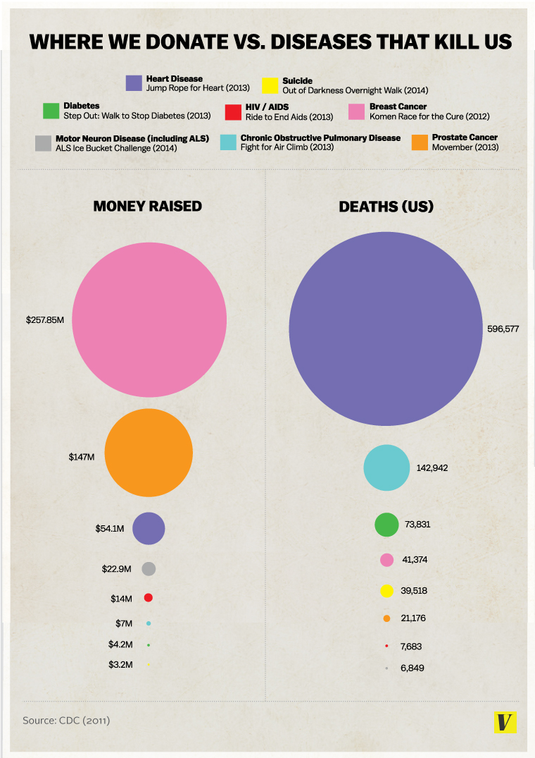
The truth about Vox's donation vs. disease infographic: It's innacurate
The infographic from Vox's article by Julia Belluz.
This week I came across a Vox article from August 20th on the truth about the ice bucket challenge. Author Julia Belluz asserts that we are more likely to donate money to attractive charities like Race for the Cure and Movember, ultimately neglecting the causes that are killing a larger number of people. She provides an infographic comparing the size of donation to number of deaths, demonstrating that we pay the most attention to breast cancer and ignore the issue of suicide. The graph features an enormous purple circle demonstrating the massive killer that is heart disease, yet the amount of donations towards curing heart disease is a relative smidge on the graph -- and that smidge is still far larger than the speck representing donations towards suicide prevention.
At first I was intrigued. Do we really spend such a disproportionate amount of money on breast cancer as opposed to suicide? Could heart disease really be such a massive killer, with ALS making the graph as a mere dot? I had a gut feeling something was wrong with the graph.
To check my theory, I copied the graphic into Illustrator and used the measure tool to determine the radius of each circle in pixels, then calculated the area of the circle. I then calculated the ratios between circles and checked their accuracy against the ratios of the data provided. (Note: marginal error may have occurred as my method of creating a vector circle atop a jpeg file was not foolproof. I do not believe this significantly changes the visual representation.)
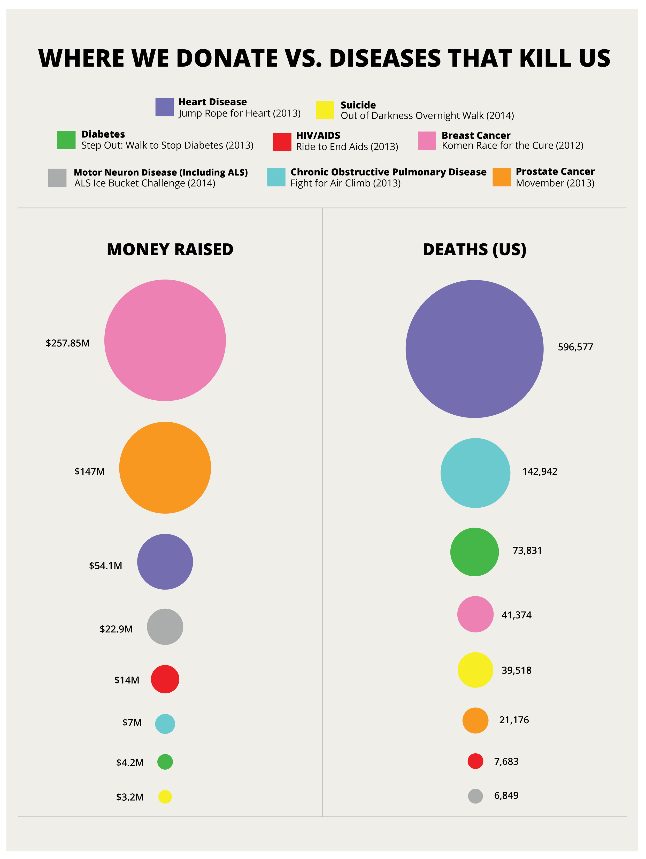
I calculated the correct ratios and created an accurate graph to represent Vox's data.
Just as I suspected, the graphic's proportions are wholly inaccurate, creating the illusion that there is an exaggerated difference in the data. For example, the deaths by heart disease to deaths by ALS ratio should be about 87:1 - a noticeable difference. But the ratio represented in the graph? 5,918:1. That's 68 times larger than it should be. A number that is 68 times exaggerated to demonstrate a point is misleading and inaccurate.
I've recreated the graph using the data correctly, which led me to a few conclusions. Yes, heart disease is a leading killer in the US, but there is a fair amount being donated to the cause. As for the donations to breast cancer and prostate cancer research, my inclination is to look into deaths and donations over time - could it be that high donations and more research over the past decade have been responsible for fewer deaths now?
The one thing Belluz doesn't talk about is the vast difference between donations towards suicide prevention and the 39,000+ deaths caused by it. She overlooked what could have been a much more interesting piece on the lack of discussion around mental health. More on that later.
Vox tailored the visual to prove their own point about the ALS ice bucket challenge. If they had written that heart disease claimed 40.5 million lives in relation to 6,849 deaths by motor neuron disease, as their visual ratio would lead you to believe, the piece would call for a thorough fact checking. Graphic representations of data should be no exception.
Vox, you may want to leave the data journalism to FiveThirtyEight. Or start fact checking your graphics a little more closely.
Update Sunday, September 14: Vox has corrected their graphic! Cheers to fact-checking and whomever helped Vox take notice of my blog post.
Click Below to Compare Graphs